Page 346 of 479
6.3.9.1.18 Check Box
The Check box (or tick box) is a graphical user interface widget that permits the user to make
multiple selections from a number of options during run time.
Every check box is linked with a single Digital tag from Tag Database. In the above white box,
normally, white space means Not selected, False, Tag Value = 0 Tick mark means, True, Tag value = 1
A caption describing the meaning of the check box is normally shown adjacent to the check box.
Inverting the state of a check box is done by touching with a finger or clicking the mouse on the box, or on
the caption.
Properties
Write design time value: If selected, it overwrites the default value defined in the tag database.
Checked: Default setting, available options True/False
For example: Tag1 is linked with Checkbox 1. If Checked, the tag = False, that means Tag1=0.
If Checked, the tag = True, then Tag1 = 1.
Text: It is Text that appears near Check box as a caption. Example: Text = P101
Events
Changed: Define action using function editor. When operator presses on check box during Run
time, the actions defined here will be executed.
Example: There are three pumps named P101, P102 and P103, and the operator would like to select pump
P101 for start-up. Using the check box, write a meaningful caption via the “TEXT” property to appear at the
right side of check box, and link each of the above check boxes with appropriate Tags. Let’s say P101,
P102 and P103. Then, when P101 is selected by the operator in run time, P101 Tag value will become 1.
 To Next Page
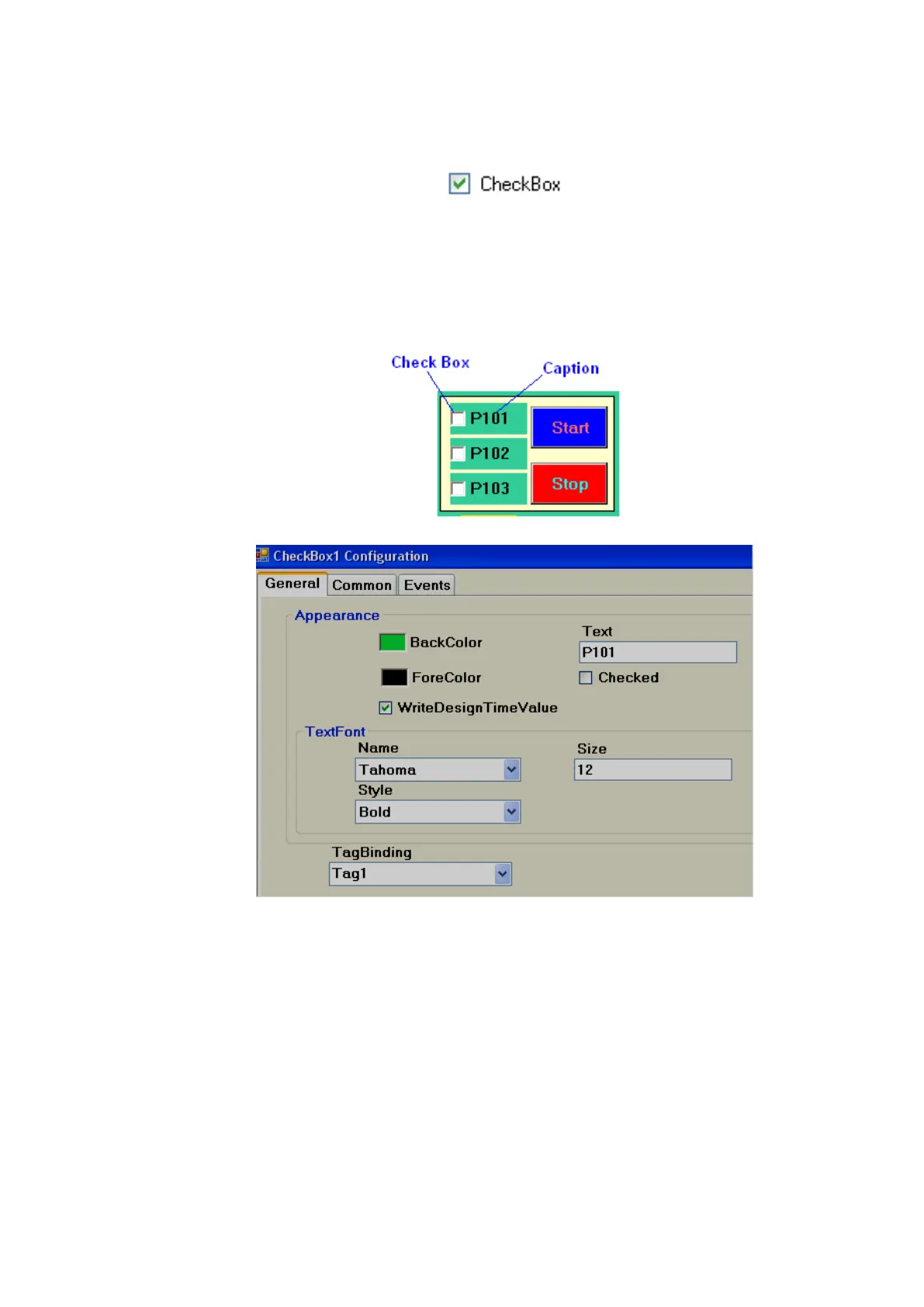