09/01/134.4 | Overview www.HandiQuilter.com
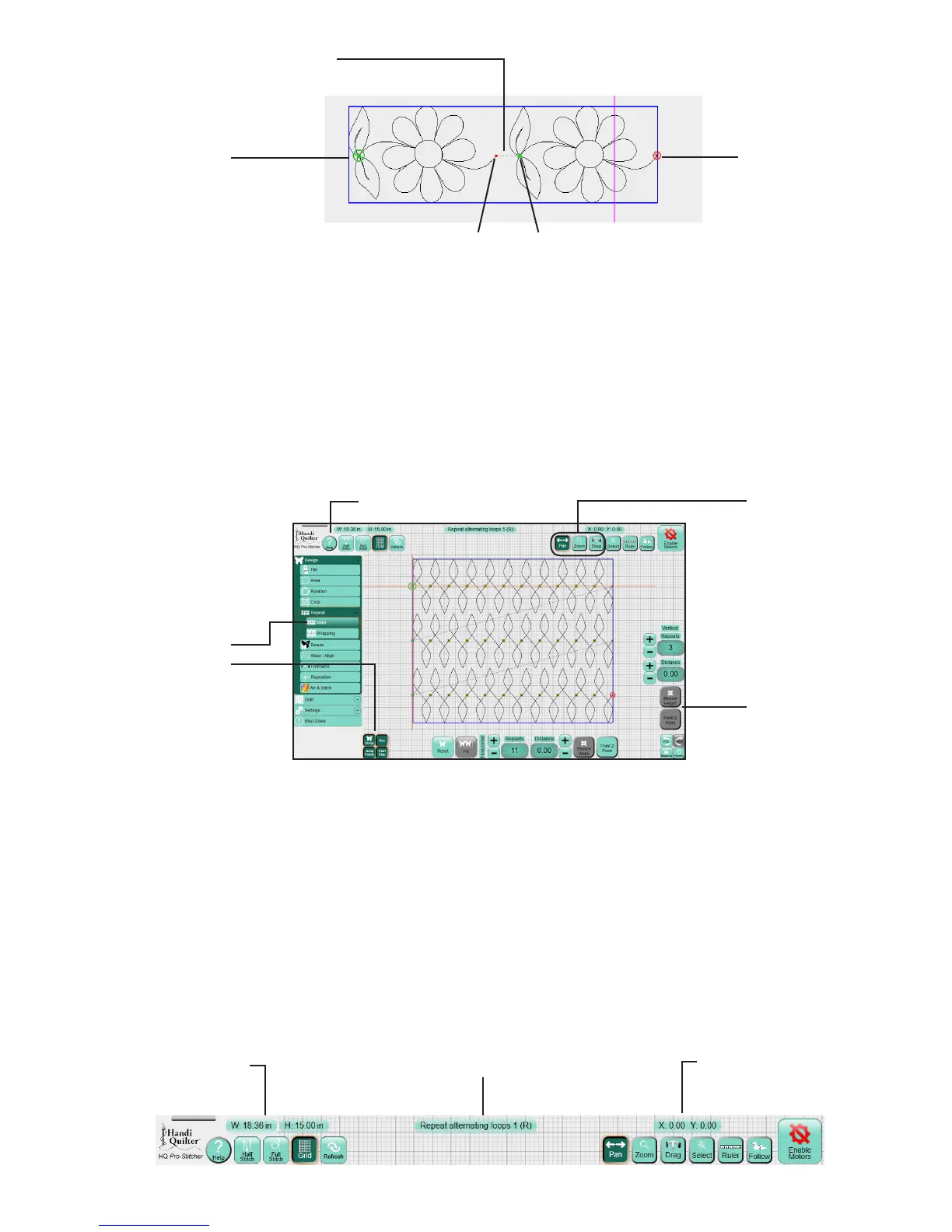
A large green circle on the loaded design indicates the start point, a large red circle indicates the stop point,
and the small green and red circles indicate the start and end points of jumps within the design. Purple
dashed lines connect the small green and red circles to show the jumps, or no-stch, lines.
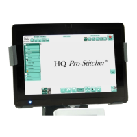
Selected vs. non-selected buons
Some buons (such as Grid and Ruler) are on/o, or toggle, buons. Turn them on or o by touching them.
Other buons are either/or buons and are turned o by selecng another buon with the opposite
acon (such as Pan and Drag).
Gray Buons
Depending on the menu or sub-menu item selected, there may be certain buons that are grayed out. A
gray buon indicates that this funcon is not currently available. This typically happens because you have
started a funcon that must be completed rst or that the grayed-out funcon is not possible within the
selected funcon.
Top toolbar buons
Commonly used funcons are across the top of the screen for easy access. They are available regardless of
which menu opon you have chosen.
Jump (doed line)
Stching start point
Stching end point
Jump start and end points
Help buon
The Grid and Ruler
buons are toggles.
Press to turn on or
o.
Selected buons and
menu opons are a
darker color.
The Pan, Zoom, Drag,
and Select buons
cannot be selected at
the same me.
A gray buon means
the funcon is not
currently available.
Design size in inches Name of current design le
Posion of crosshairs
 To Next Page