Interface description
LITECOM, Commissioning and maintenance instructions 17.0 | 04.2024 | en 25
6.5 Navigation principles
There are different buttons in the web application for commissioning, configuring and operating the system. If a
button is tapped, its colour changes briefly.
Set value (e.g. on the start page)
You can enter a specific value in the click area so that all devices have the same control
value.
If, for example, different control values (80%, 60%) are set for the luminaires and you tap
on 50%, all luminaires switch to the control value of 50%.
If you tap on the left or right click area, the value you are setting decreases or increases
respectively in the entire effective range by one unit. If different control values are saved
for the luminaires (80%, 60%, 20%) and you tap on the button, these control values
are increased by one unit (81%, 61%, 21%). This function is not available for all setting
options.
Set value (e.g. fade time)
Tap these buttons to increase or decrease the value being set. Tap the button to change
the value by one unit. Tap and hold the button to change the value, and release when
the desired value has been reached. The longer the button is held, the faster the value is
changed.
Special feature: set the time
If the time is tapped, the Set time view appears. The hours and minutes can be set
separately here.
Expand – collapse
The arrow indicates that additional information or selection options can be displayed
(e.g. devices in a group).
Tap the arrow pointing right to expand the information or selection options. The arrow
changes so that it is pointing down.
Tap the arrow pointing down to collapse the information or selection options. The arrow
changes so that it is pointing right again.
Save or confirm
Tap this button to save the settings or confirm a message.
Option not selected – option selected (single choice)
This button marks multiple options that are available (e.g. different types of date groups),
from which only one can be selected. As soon as an option for a switch is selected, all
other switches change to the other option accordingly.
Option not selected – option selected (multiple choice)
This button marks multiple options that are available, from which multiple options can be
selected. As soon as an option is selected, it is highlighted.
Setting not selected – setting selected
If an empty button is tapped (e.g. blind position at device level), the button is filled in with
colour. One or more control elements (such as sliders) appear below.
Switch between individual pages of the app overview
The number of points corresponds to the number of the pages in the app overview. The
point filled in with colour indicates the page currently being displayed. Tap an empty
point to go to the corresponding page.
Tap the logo to access the Information view. This page contains manufacturer
information, the reference number and version of the web application and information on
the licences used.
Table 13: Navigation principles
 To Next Page
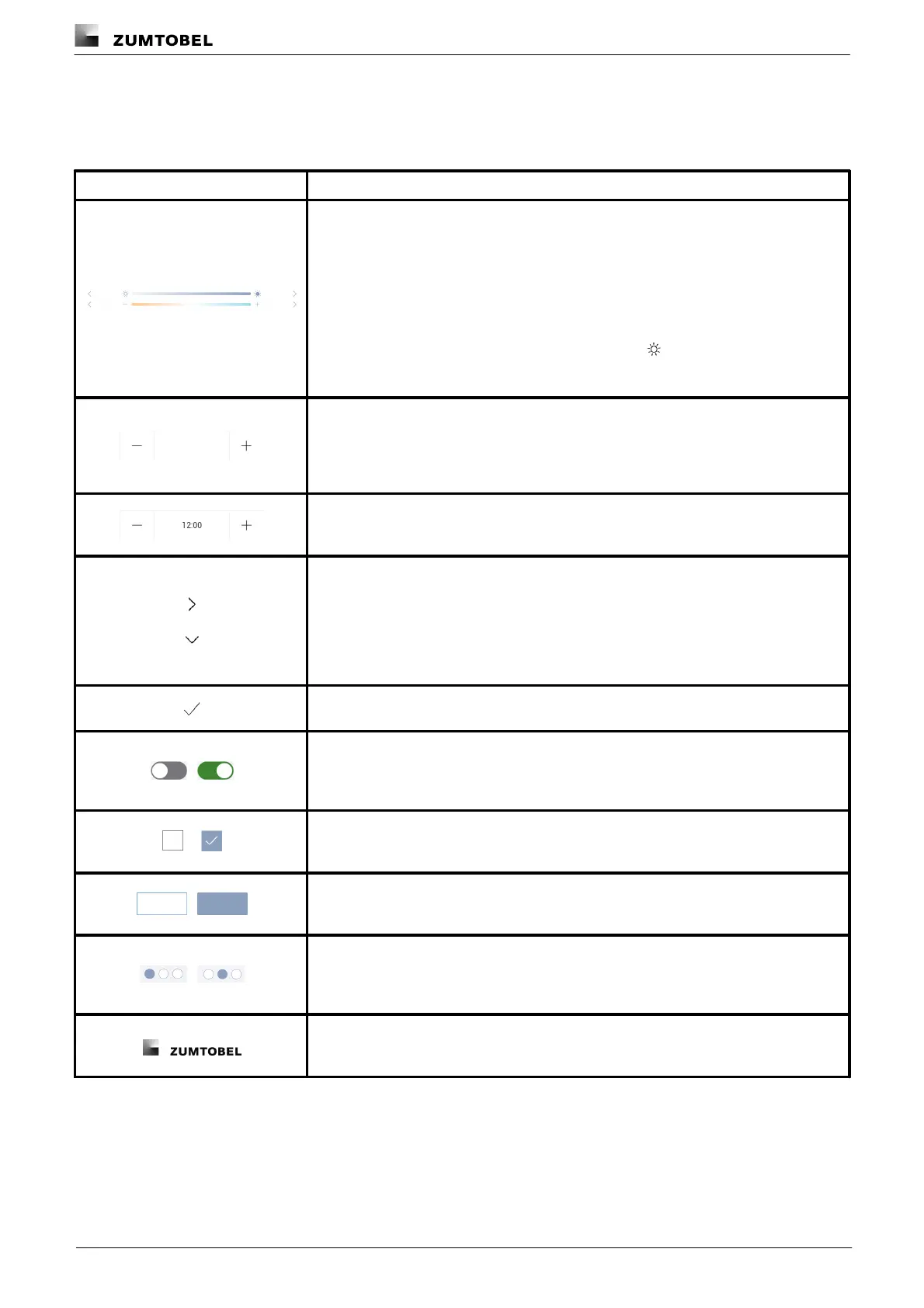 Loading...