11-29
StudioWare
The X, Y, width, and height parameters provide another way to position
widgets inside a panel. Note that the Show Label and Show Value
options use up some of the space allocated to a widget. This means that
enabling one or both of these options on an existing widget will shrink
the knob or slider to allow room for the text.
In addition, you can import your own bitmap artwork to customize the
appearance of widgets in a panel. Some widgets require only a single
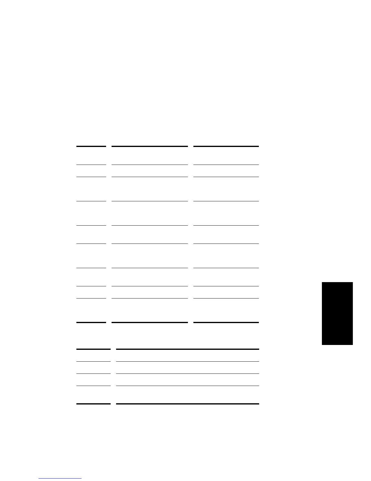
bitmap, while some require two, as indicated in the following table:
There are three bitmap options for a widget:
Type of
widget...
Background bitmap... Foreground bitmap...
Cluster Wallpaper for the entire cluster Unused
Button Up position of the button (drawn
with transparent background)
Down position of the button
(drawn with transparent
background)
Knob Knob image, stretched to fill the
widget’s area
Knob pointer, at original
scale (drawn with
transparent background)
Slider Slider background, stretched to
fill the widget area
Slider thumb, at original
aspect ratio
LED Indicator, when OFF (drawn with
transparent background)
Indicator, when ON (drawn
with transparent
background)
Meter Dark part of meter, stretched to
fill the widget area
Lit part of the meter
Text Unused Unused
Image Displayed image, tiled to fill. If a
foreground bitmap is assigned,
the background bitmap is ignored
Displayed image, stretched
to fill
Option... How it works...
Default The standard (default) StudioWare bitmaps are used
None No bitmaps are used
Custom You assign custom foreground and background bitmap images
(in .
bmp
or .
dib
format) to the widget
 To Next Page