7.3.5. Measured Sonication Parameters Indicators
This frame indicates the actual measured acoustic energy and power of the last sonication.
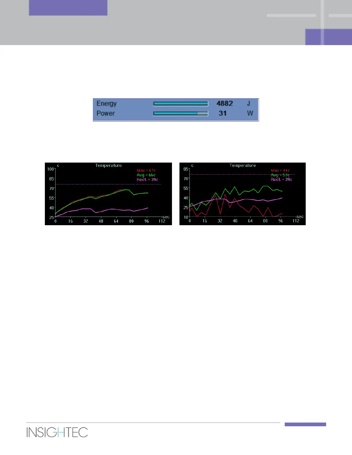
Figure 7-5: Measured Sonication Parameters Indicators
7.3.6. Temperature Graph
Figure 7-6: Temperature Graphs (left – nominal, right – thermal noise)
During the sonication, a cross-shaped cursor automatically appears on the hottest spot. The temperature
graph shows the temperature change during a sonication at the cursor location.
Inspect the temperature map for noise that was miscalculated as Thermal Dose. Noise can be identified by
searching for pixels that have inconsistent temperature readings in relation to their neighbors. Utilize the
temperature graph to locate these pixels by looking for pixels with "temperature jumps" (Figure 7-6, right).
The graph shows:
◼ Red Line – the evolution of the temperature at the cursor location, during and after sonication.
◼ Green Line – the average temperature around that cursor.
◼ Magenta Line – the maximum measured temperature adjacent to the rectal wall drawing
◼ Dashed (Magenta) Line – a (visual) marker indicating the temperature of 75
o
c.
◼ Azure Line – the average temperature within a measurement polygon.
◼ The highest temperature reached by each graph line is displayed on the upper right position of the
frame.