VIsualEyes 515/525 - Additional Information Page 33
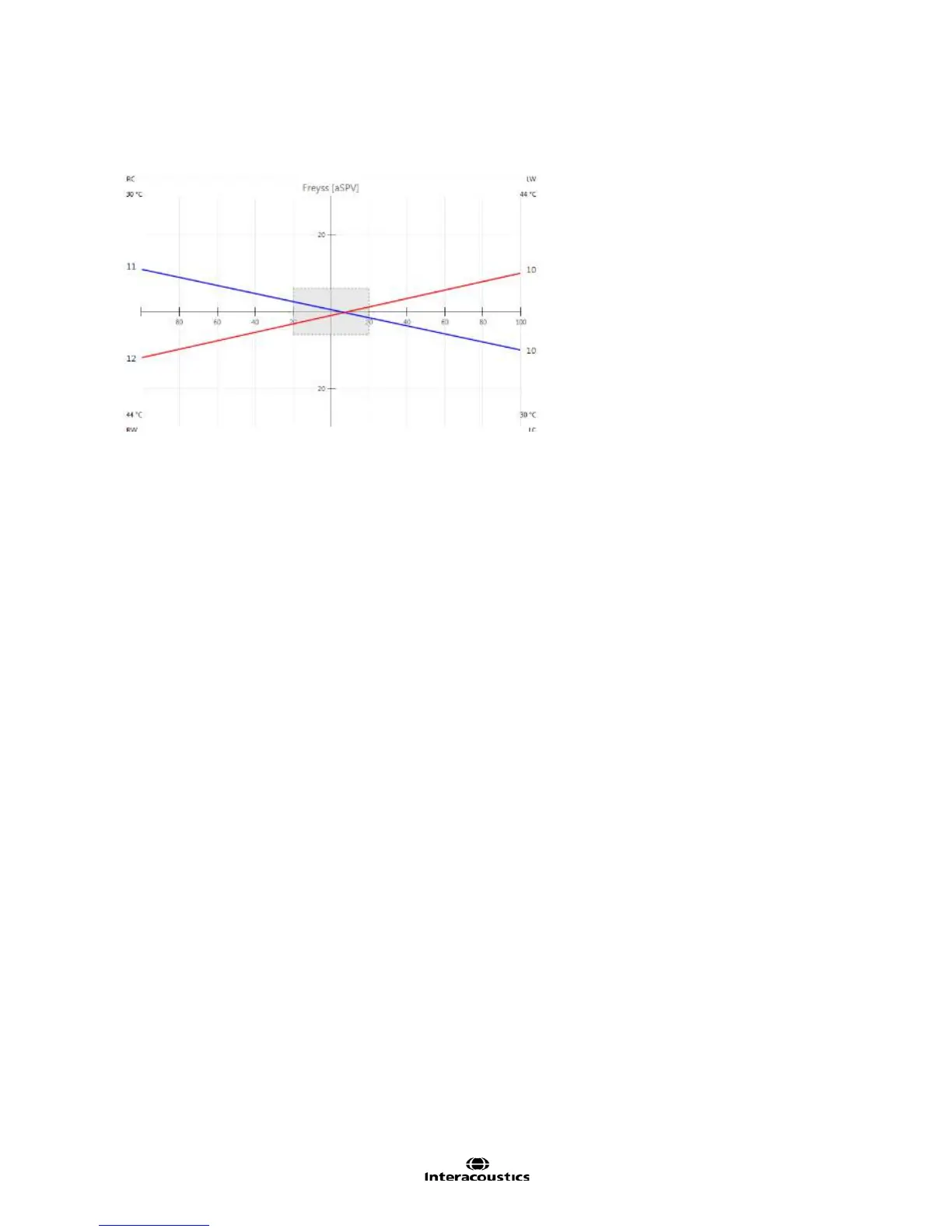
Freyss diagram
The Freyss Diagram graphically represents the average slow phase velocities (a.SPV) during the peak
response of each irrigation.
Figure 3.5.8 Freyss diagram
On the left vertical axis, the a.SPV calculated for the irrigations of the right ear are plotted; data points on the
right vertical axis show the a.SPV values for left ear irrigations.
The rectangular box in the center of the Freyss diagram outlines the Unilateral Weakness cut-off value.
The diagram is completed by two lines: one connecting the data points obtained for the two warm irrigations,
the other one connecting the data points representing the two cool irrigations. The two lines described above
will intersect either to the left or to the right of the rectangle in patients with UW larger than the threshold
value.