Horizontal Alignment
Same as for other objects. All text in the table will be aligned either center, left or right.
Vertical Alignment
Same as for other objects. All text in the table will be aligned either center, top or bottom.
Table Specific
Grid Color (Theme dependent)
This represents the color of the "grid" (the inner border) of the table.
NOTE: If you want to change this property via JavaScript, the property name "Foreground
Color" needs to be used instead of "Grid Color".
Default: black (0, 0 ,0)
Possible values: any color
Table Data Delimiter
This is the delimiter char that is used to mark the beginning of a new column inside each
line of the table's text data. If the text data source contains another character as delimiter,
enter this here.
Default: ;
Possible values: any single character
Table Heading Background Color (Theme dependent)
If the property Show Table Heading is enabled, a heading line will be displayed at top of
the table. With this property a background color for the heading can be set.
Default: grey (153, 153 ,153)
Possible values: any color
Table Heading Font Color (Theme dependent)
If the property Show Table Heading is enabled, a heading line will be displayed at top of
the table. With this property a font color for the heading can be set.
Default: white (255, 255 ,255)
Possible values: any color
Table Heading Text
A static text that will be displayed if Show Table Heading is enabled. Text for all columns
can be entered, every column is delimited by the Table Data Delimiter.
Default: <no text>
Possible values: any text
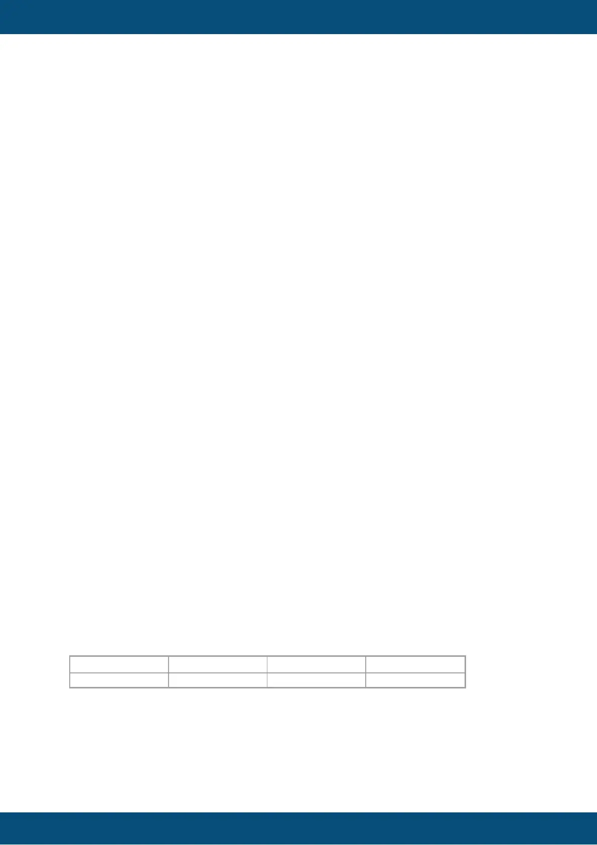
Example (with delimiter ; ):
This;is;a;table
will result in:
Language dependancy is not possible for table heading texts. If you need language
dependant headings, please use String Fields, put them above the table and configure
them as language dependant.
Show Table Heading
Show or hide the heading of the table. See other heading properties above.
 To Next Page