Working With Buttons
100
TPDesign4 Touch Panel Design Program
The following button state properties are supported (some properties only apply to certain button
types, as indicated in the table):
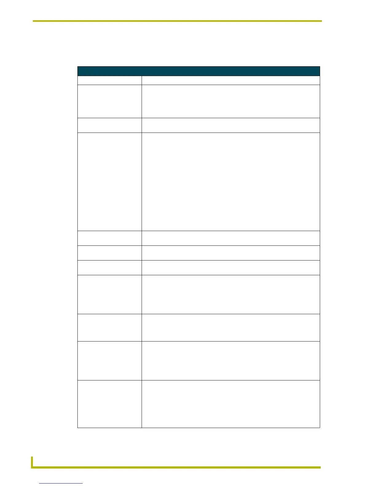
Button State Properties
Parameter Description
• Border Name: To change the Border Name for the selected button, click Border Name, and
select the desired border from the drop-down list. If a Border Style was specified
in the General tab, then the borders listed here are limited to those contained in
the selected Border Style. If no Border Style was specified, then all border
names are available to choose from.
• Border Color: To change the border color for the selected state(s), click the browse button to
open the Colors dialog.
• Fill Color: To change the border color for the selected state(s), click the browse button to
open the Colors dialog. Note that for bargraph buttons, the preview image in the
State Manager works differently than for the other button types. For bargraph
buttons, the on and off states are used to indicate a level setting rather than a
push/release. As a result, the button image in the Design View window will indi-
cate the bargraph button as it will appear on the touch panel, but the thumbnails
in the State Manager window indicate each state as a separate preview image.
For example, the bargraph button shown below uses yellow as the On state fill
color, and green as the Off state fill color. In the State Manager window you
would see the On state (yellow) and the Off state (green) as individual thumb-
nails.
Also note that the Button Preview window works differently for bargraph buttons
than for the other button types. Rather than using the Push button to view the dif-
ferent states, click and drag on the slider with your mouse cursor (in the Button
Preview window) to preview the feedback.
• Text Color: To change the border color for the selected state(s), click the browse button to
open the Colors dialog.
• Text Effect Color: If you have selected to apply a text effect, use this field to specify the color of the
selected effect. Click the browse button (...) to open the Colors dialog.
• Overall Opacity: Use this field to specify the level of opacity for the selected button (0 - 255, where
0 is totally transparent, and 255 is totally opaque). The default is 255.
• Video Fill: To apply a video fill to the selected state(s), click the down-arrow to open the list
of available video sources (1-4). This option is only available for video-capable
panels (NXP-TPI/4, NXD/T-CV12, NXD/T-CV15). If your project specifies a panel
that supports wireless video the Wireless Input option is available as a video
source. If a video source is selected, the Video Cropping and Video Pass-Thru
options become available:
• Video Cropping: Use this field to specify the number of scan lines to be removed from both the top
and bottom of the video signal (used for display of non-4:3 video without letter-
box areas). For best results, set the video button's aspect ratio to match the
video input aspect ratio.
• Video Pass-Thru: Select Yes from the drop-down menu to enable video pass-thru (disabled by
default). Video pass-thru allows you to pass touch/control information from a
touch input device (touch panel, mouse or keyboard) through a NXP-TPI/4 to a
controlled device with video-out capabilities. This feature is also used in conjunc-
tion with the MPS (mouse pass-thru) and KPS (keyboard pass-thru) send com-
mands.
• Bitmap: To apply an image file as the background image to the selected state(s), click the
browse button to open the Select Resource dialog, where you can select an
image file from among those imported into the project.
Note: If pairs of image resources exist that end in *off/*on, *f/*n, *0/*1, *1/*2
(case insensitive), and the first in the pair is applied to the Off state of a General
button, the second will be automatically applied to the On state to make it easier
to set up images on a General button.
 To Next Page