Animations and Tweening
152
TPDesign4 Touch Panel Design Program
5. Select Tweeners to open the Tweeners sub-menu, and apply each of the top three tween options
(Border Color, Fill Color and Text Color)
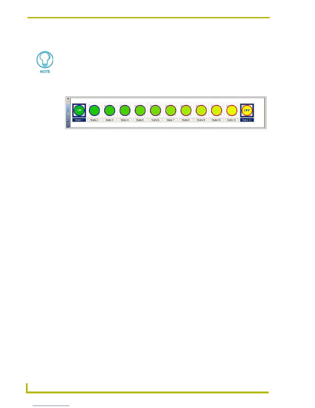
6. The thumbnails in the State Manager change to show the results of the tween options applied.
Notice the gradual transition in border and fill colors..
7. To preview the animation as it appear when the button is pushed, select View > Button
Preview to open the Button Preview window, and click Push.
Creating Color Transition Effects
Use the Border Color, Fill Color and Text Color Tweeners to easily apply color transition effects to
your multi-state buttons. The color tweeners can be used individually, or in combinations to create
smooth fades from one color to another when the button is touched.
With 256 states available to use as "frames" in a tweened animation, these effects can be made to be
very subtle and smooth. However, most color transition effects don't require that many frames to
produce a very smooth fade.
When used in combination with TPD4's ability to handle RGB colors (including the opacity
setting), it is also possible to use tweening to make buttons fade in and out on the page. Note that to
make buttons fade in/out completely, you would have to create the button without a border
assignment, since transparent borders are not supported n this version of TPDesign4.
When the button is turned On it will display all the assigned states from first to last with a specified
time interval between each state's display. This is called "Range Time Up", and is definable in 1/
10th second increments. When the button is turned back Off, the states will be displayed in reverse
order. This is called "Range Time Down", also definable in 1/10th second increments. The Range
Time Up and Range Time Down values are set via the States tab of the Properties Control window.
To create a color transition effect (the following steps apply to all three button color attributes
(Border, Fill and Color):
1. Select (or create a new) multi-state button with at least three states. Note that the more states
you use, the smoother the transitions will appear.
2. Apply a color to the last state that is different from that of the first state. To create a fade effect,
leave the colors the same for the first and last states, but change the opacity on one of them to
zero (via the Colors dialog, set to RGB colors). An opacity setting of zero makes the button
totally transparent. An opacity setting of 255 (max) makes the button totally opaque.
3. Ctrl+click to select two stages in the State Manager window that are separated by at least one
stage (do not select the intermediate stages). The color tweener(s) will generate a transition
The Bitmap Position, Icon Position and Text Position tween options only work when
the Bitmap, Icon and Text Justification settings are set to Absolute positioning (via the
States tab of the Properties Control window).
FIG. 38 Tweening example 4
 To Next Page