Program Preferences
159
PDesign4 Touch Panel Design Program
Preferences Dialog - Appearance tab
Select Edit > Preferences to open the Preferences dialog where you can set general program
preferences for TPDesign4. Click on the Appearance tab to customize display and grid settings for
the Design View window. The items in the Preferences dialog - Design View tab include:
Window:
• Initial Zoom: Click the down arrow to open a drop-down list of the zoom settings that can be
applied as the default initial zoom setting for all new Design View windows.
• Gutter Color: The Gutter is the area around the outer edge of the Design View windows. Click
the down arrow to open a palette used to set the default color for the gutter on all
new Design View windows.
• Auto Stack New
Windows:
Use this option to automatically stack new Design View windows directly on top of
each other, so that only the most recently created or opened page is visible
(default = enabled).
Grid:
Grid Style: Select from the drop-down list of styles that the grid can be displayed in (Line,
Dashed Line or Dots).
Grid Size: Use the up/down arrows to set the default grid size (measured in pixels). The
range is 4 - 255, the default setting is 8.
Snap Tolerance: Use the up/down arrows to specify the snap tolerance for the grid. The snap toler-
ance represents the number of pixels within which objects in the Design View win-
dow will "snap" to the nearest grid line (applicable only when the Snap To Grid
option is enabled, via the Button Selection/Drawing Tools toolbar).
Grid Color: Click the down arrow to open a palette used to set the default color for the grid (if
enabled) on all new Design View windows.
Transparency: Transparent colors in TPDesing4 are represented by a checkerboard pattern. This set of
options allow you to modify the way that the transparency checkerboard appears. In certain situations,
changing the checkerboard style to different sizes, shades and/or colors can facilitate viewing and working with
graphics.
Note: The Transparency checkerboard is visible on pages and popup pages that are transparent, in the State
Manager when a state is transparent, and in the Button Preview when a state is transparent.
• Style: Click the down arrow to open a drop-down list of available checkerboard styles
that can be used to represent transparency. The options are Light, Medium, Dark
and Custom. If Custom is selected, the Custom Colors option is enabled (see
below).
• Size: Click the down arrow to open a drop-down list of available checkerboard sizes.
The options are Tiny, Small, Medium and Large.
• Custom Colors: If Custom was selected as the Style (see above), then you can specify a custom
color combination for the checkerboard by selecting from these two drop-down
lists.
Reset: Click to reset all options in the Application tab to their default settings.
Reset All: Click to reset all options in both tabs to their default settings.
OK: Click to save your changes and close the Preferences dialog.
Cancel: Click to close the Preferences dialog, without saving any changes.
Apply: Click to apply any changes.
 To Next Page
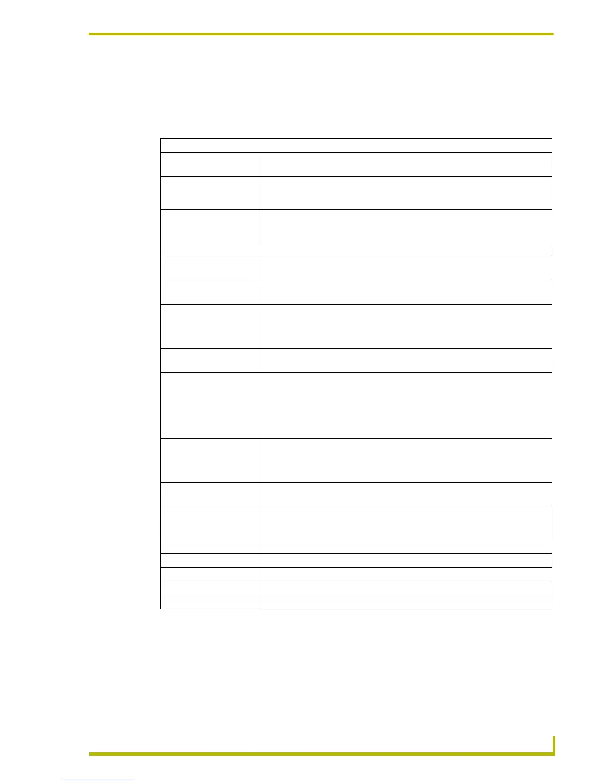 Loading...