Working With Buttons
94
TPDesign4 Touch Panel Design Program
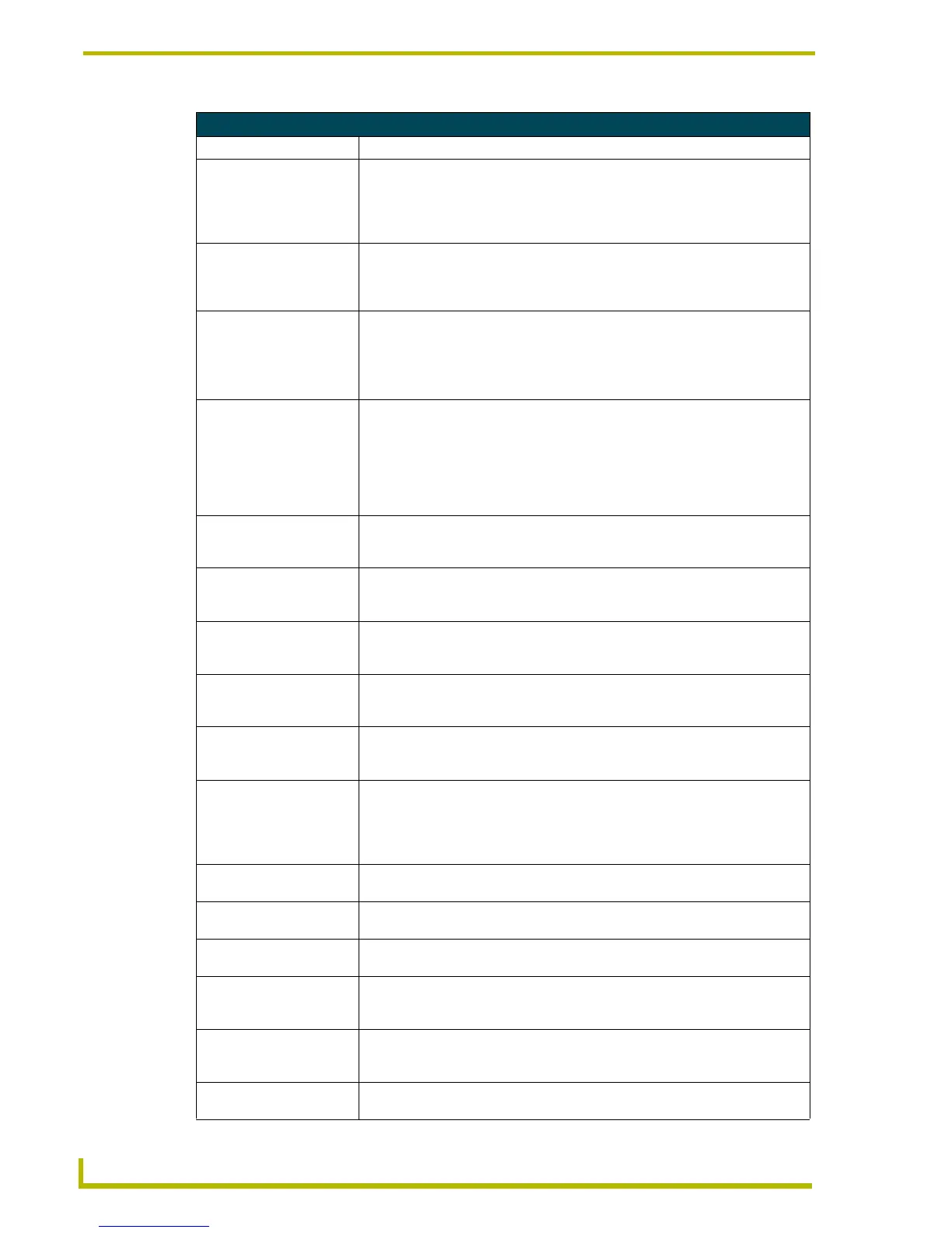
General Button Properties (Cont.)
Parameter Description
• Left/Top: Position values. The Left and Top rows indicate the position of the selected but-
ton, in pixels, relative to the upper-left corner of the Design View window. You
can edit these fields to apply specific positioning info for the button. Note that if
you select the button and manually move it around on the page, these constantly
update to indicate the current position.
• Width/Height: Size values. The Width and Height rows indicate the dimensions of the selected
button, in pixels. You can edit these fields to apply specific dimension info for the
button. Note that if you select the button and manually resize it on the page,
these constantly update to indicate the current dimensions.
• Above Popups: This option allows you the selected button(s) on a Main page to always remain
on top of any popup pages (default = No). This option is not available for buttons
on a popup page.
Note: If you set this property on a button (on a main page), then copy that button
to a popup page, the program automatically resets this property to No.
• Touch Style: This selection drop-down allows you to set a "touch style" for the selected but-
ton(s). Touch style describes the way buttons behave when pressed, in terms of
the shape and border style used. For example, by using transparencies you
could create a button that appears to be round (although the actual shape of the
button is rectangular), in which case you may not the button to respond if the
user presses outside of the circular border. See the Working With Touch Styles
and Active Touch section on page 102 for details.
• Remote Host
(Computer Control
buttons only):
The IP or DNS resolvable address of the PC whose desktop is to be displayed.
•Password
(Computer Control
buttons only):
The password supplied by the designer. This password must match the pass-
word entered into the PC remote desktop server component.
• Color Depth
(Computer Control
buttons only):
Select the color depth to be applied to the button (high-color (16-bit) or true color
(24-bit)). This setting should match that of the host PC.
• Compression
(Computer Control
buttons only):
Select wether to compress the image on the button (yes/no). By default, com-
pression is disabled.
• Scale To Fit
(Computer Control
buttons only):
Select wether to automatically scale the image to fit the button (yes/no). By
default, scaling is disabled.
• Border Style: To change the Border Style for the selected button, click Border Style, and select
the desired border style from the drop-down list. If a Border Style is selected
here, then the Border Names (set at the state level, via the States tab) are limited
to those contained in the selected Border Style. If no Border Style is specified,
then all border names are available to choose from, at the state level.
• State Count
(Multi-State buttons only):
This read-only field indicates the number of states associated with the selected
button.
• Animate Time Up
(Multi-State buttons only):
The time intervals between states as the button animates from the Off to the On
state. This value is in 1/10th second increments (default = 2).
• Animate Time Down
(Multi-State buttons only):
The timer intervals between states as the button animates from the On to the Off
state. This value is in 1/10th second increments (default = 2).
• Disabled: Indicates how the selected button is rendered. If the button is set as Disabled
(select Yes from the drop-down), the button will be rendered by the panel in a
subdued state (default = No).
• Hidden: Indicates whether or not the selected button is displayed on the panel. If the but-
ton is set as Hidden (select Yes from the drop-down), the button will disappear
when downloaded to the panel (default = No).
• Direction
(Bargraph buttons only):
Set the orientation of the bargraph to Ver tical or Horizontal.
 To Next Page