Test Results
POWER (P6): Divides OFDM signal into segments of 6MHz bandwidth, then calculates channel power
separately for each segment.
POWER (PLC): Channel power at location of PLC (power line communication). (6MHz)
POWER (MAX): Maximum readings of all POWER (P6) within OFDM frequency span.
POWER (AVG): Average readings of all POWER (P6) within OFDM frequency span.
POWER (MIN): Minimum readings of all POWER (P6) within OFDM frequency span.
MER (PLC): Average MER value of OFDM valid subcarriers (8 or 16) with PLC signal.
MER (AVG): Average MER value of all OFDM valid subcarriers.
MER (STD DEV): Standard deviation among all valid subcarriers’ MER and average values.
MER PCTL (2%): Normal (Gaussian) distribution of all valid subcarriers according to the MER value. This
value is a MER statistical threshold, that is, the number of carriers whose MER is lower than
this threshold occupies all the active carriers 2% of the number.
CW (TOTAL): Total Code Word, the total number of transmission code words.
CWE (Uncor): Uncorrected code word error, uncorrectable error code word.
CWE (Corr): Corrected code word error, error-correcting error code word.
23-1.2 Interpreting the Data
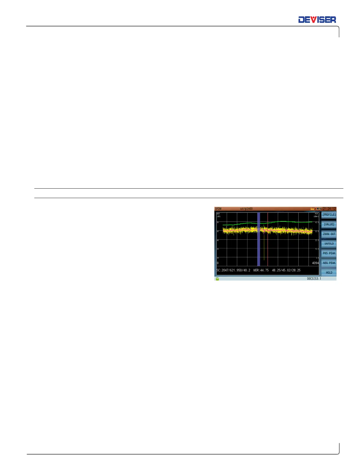
The test interface includes a color-coded graph of signal levels
and MER carrier statistics (shown, right). The graph illustrates two
important measurements: the P6 power distribution curve, and
the MER distribution curve.
Power (P6) Distribution Curve
When performing this measurement, the OFDM signal is first
divided into 6MHz-bandwidths, and then the power levels of
each segment are calculated and connected into a curve.
This appears as the
green
trace in the graph.
For example, in a 4K OFDM scenario where the occupied bandwidth is 204.8MHz and each carrier is 50kHz,
the signal can be divided into 32 frequency bands of 6MHz, each covering 120 carriers. By calculating the
power levels of these 32 bands, we get 32 distinct data points to connect into a trace.
MER Distribution Curve
Here, the DS2831 reads the MER of all subcarriers and processes them according to the width of the display
window. This appears as the
yellow
and
pink
traces in the graph.
For example, in a 4K OFDM scenario where the display window is 256 pixels wide, each pixel must display
the MER data of 16 carriers. By calculating the maximum, minimum, and average MER of these 16 carriers
and plotting them, the user can see how they fluctuate over time.
In the graph above, the yellow trace reflects the difference between the maximum/minimum MER values
of
all carriers in each column, while the pink curve reflects their average MER. The blue translucent region
marks the PLC frequency.
You can also move the cursor (red line), using the touchscreen or arrow keys. Check the bottom of the
screen to see the subcarrier currently marked by the cursor, as well as its carrier number, frequency, power
level, MER, and more. The cursor can be moved to the corresponding carrier with the positive/negative
peak search tools (F5 and F6).