237
Accessing Yield Data
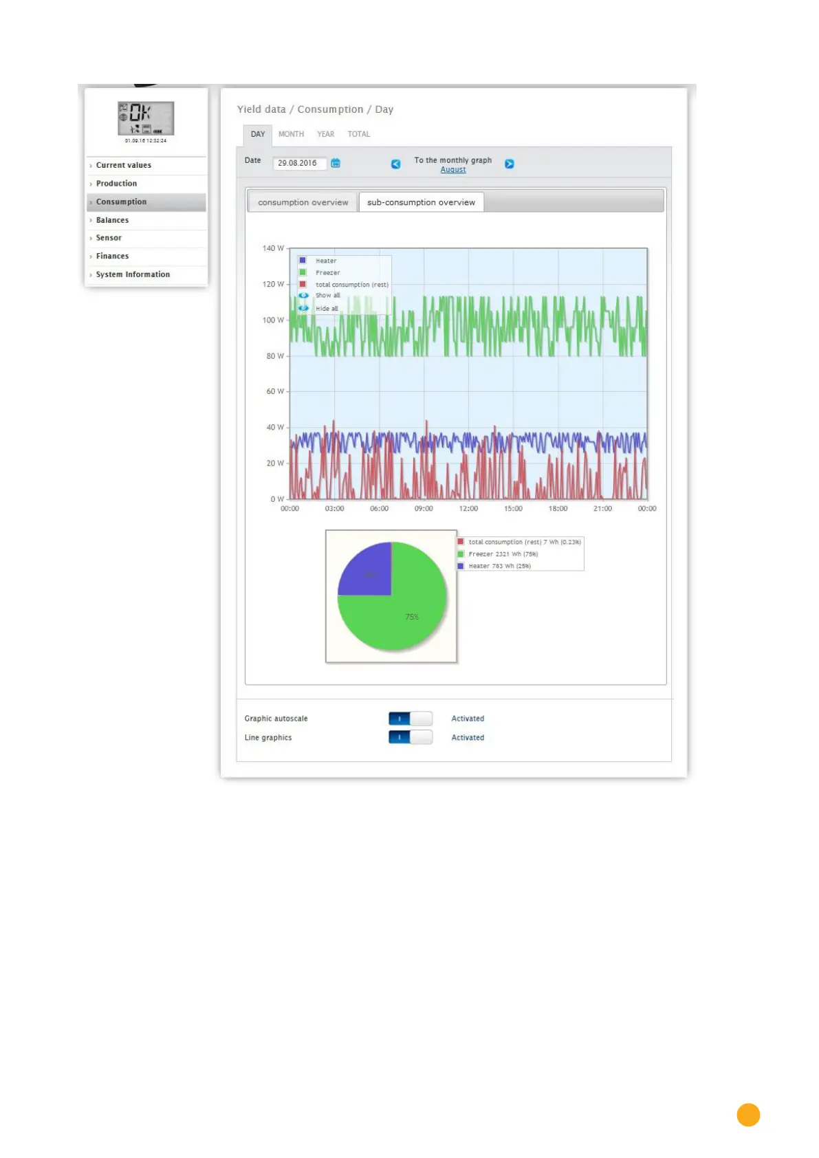
Fig.: Graph of daily consumption with connected appliances and active line graphics in the sub-consumer view
You have the option to select additional menu items in the consumption view.
•
Month:
displays the Month Graph View as a bar graph. There are two tabs in the Month View, the same as in
the Day View:
The
Consumption Overview and the Sub-consumer Overview.
The total consumption values are displayed in the Consumption Overview as a bar graph.
In the
Sub-consumer Overview, you see the devices connected as a bar graph with the power
consumption displayed in different colors.
Below this, the values are also displayed in a pie chart with the
colors in the key.
There is the option from both views to select the individual days directly from the individual bars and
sections.