List Box Buttons
91
PDesign4 Touch Panel Design Software (v2.10 or higher)
Setting List Box Button Column Properties
Once you have created a List Box button, you can use the General, Programming, States tabs of the
Properties Control window to set/edit button properties for a selected column (within the List Box button
container).
Properties applied to a column will affect all buttons in that column.
List Box buttons consist of a container and subordinate buttons that are created with Columns
and Rows.
If you select a column within the container (as opposed to the List Box button container itself),
you can set button properties that apply specifically to the selected column.
To edit any of the properties in the table, click on an item in the right-hand column to activate the field.
Depending on the item selected, you can either set the item manually, select from a drop-down menu, or
both.
Setting General Properties: List Box Button Columns
By selecting a column within a List Box button, you can use the General tab of the Properties Control
window to set/edit general (non-state oriented) button properties. To edit any of the properties in the
table, click on an item in the right-hand column to activate the field. Depending on the item selected, you
can either set the item manually, select from a drop-down menu, or both.
When a column is selected within a List Box container, the following General Properties will appear in
the List Box General Properties toolbar.
FIG. 55 Column selected
There are additional properties that can be applied to the List Box button container.
See the Setting List Box Container Button Properties section on page 87 topic for
details.
•Type See page 120.
•Name See page 118.
• Description See page 114.
•Width See page 120.
• Above Popups See page 113.
• Border Style See page 113.
 To Next Page
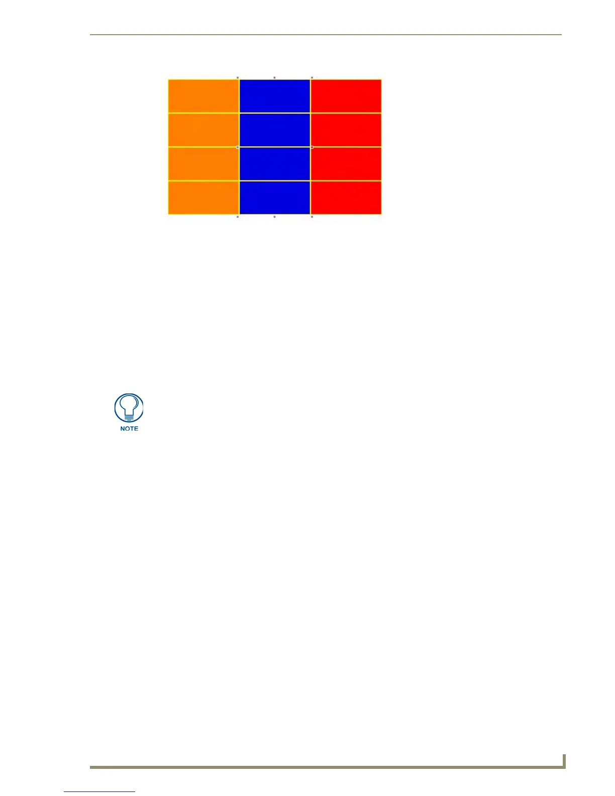 Loading...


