Working With Properties
114
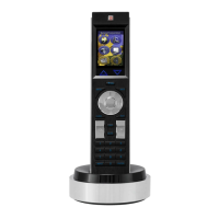
TPDesign4 Touch Panel Design Software (v2.10 or higher)
General Properties (Cont.)
Column Sort Order Specifies the column sort order for the list table data before populating the list box
control. The value is a space delimited string of integers representing columns in
the List Data Table.
• One or more columns can be specified.
For example, if the user wishes to sort the table based on column 1, the value
would be "1". If however the user wishes the table data to be sorted by column 3,
then column 1, and finally column 5, the value would be (without quotes, with a
space between each number) "3 1 5".
• Multiple column sorting is useful when a column contains duplicates or more than
one cell is empty.
Note: This property is enabled only when a List Data Table is assigned, and a List
Table Address and Port is assigned.
Compression Select wether to compress the image on the button (yes/no). By default, compres-
sion is disabled.
Computer Control buttons only.
Cursor Color Click the browse button to open the Colors dialog, where you can select a color to
apply to the cursor.
Joystick buttons only.
Cursor Name Select a cursor type (arrow, ball, circle, crosshairs, etc.) from the drop-down list.
The cursor types are previewed on the joystick button (in the design view window).
Joystick buttons only.
Description Use this text field to enter a general or functional description for this button.
Click the browse (...) button to open the Enter Text dialog, where you can type the
description.
Disabled Indicates how the selected button is rendered. If the button is set as Disabled
(select Yes from the drop-down), the button will be rendered by the panel in a sub-
dued state (default = No).
Display Type Click to select the display type to be invoked by this Text Input button (single or
multiple lines).
Text Input buttons only.
Group To add a group, type any value in the Group field. This will create a corresponding
folder under the Popup Pages folder in the Workspace Navigator (Pages tab).
To place a popup page in a particular popup group, simply drag the desired popup
pages into the desired group folder.
Popup Pages only.
Height Size values. The Height rows indicate the vertical dimensions of the selected but-
ton, in pixels.
• You can edit these fields to apply specific dimension info for the button.
• Note that if you select the button and manually resize it on the page, these values
constantly update to indicate the current dimensions.
Hidden Indicates whether or not the selected button is displayed on the panel. If the button
is set as Hidden (select Yes from the drop-down), the button will disappear when
downloaded to the panel (default = No).
 To Next Page
 Loading...


