www.trilithic.com
Page IV-162
180 DSP Operation Manual
Signal Level Meter
Signal Density
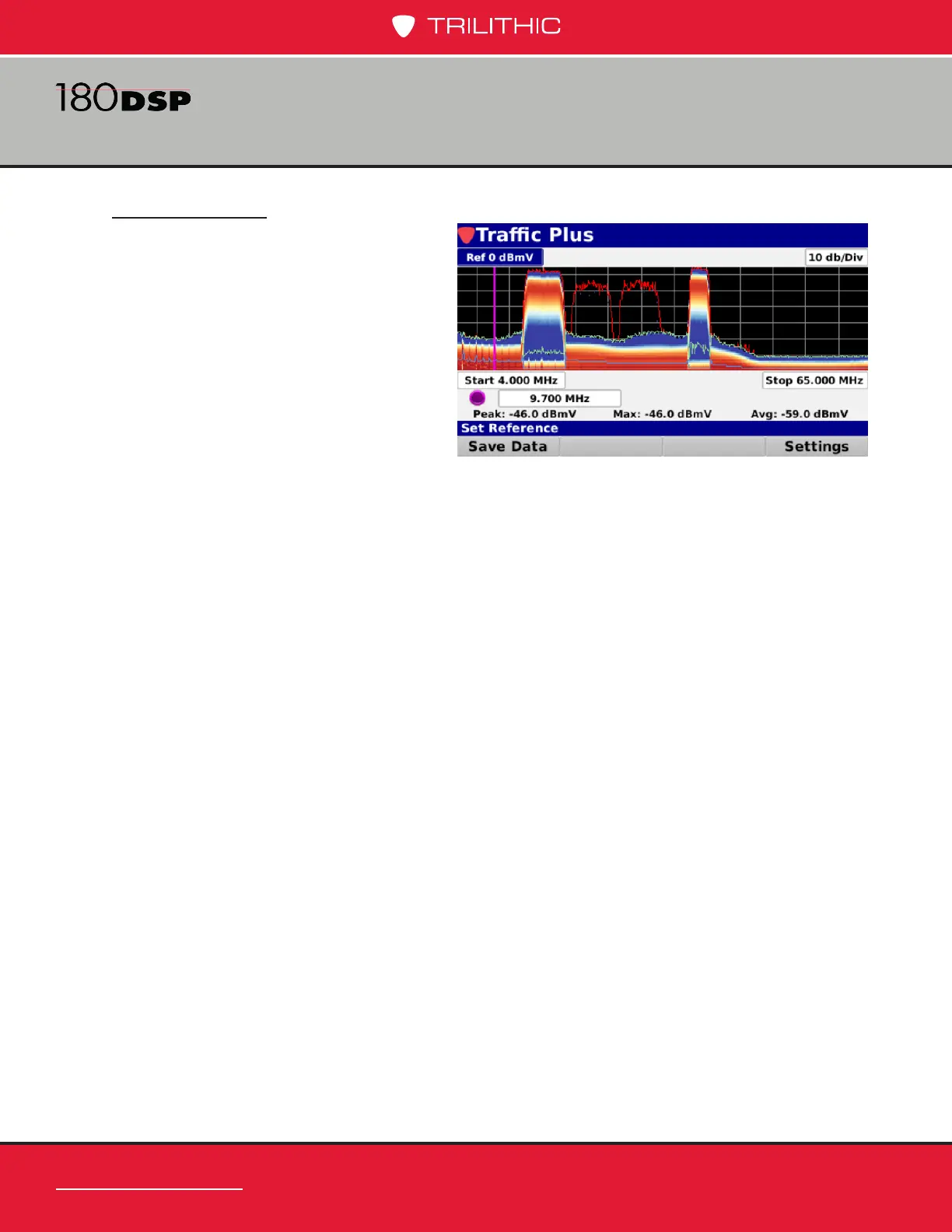
Along with the previously described
traces, the Trafc Control Plus
spectrum shows the distribution of
spectral power using color to represent
the prevalence of a signal. This gives
the user a visual cue if the event is
occurring frequently, infrequently,
or somewhere in between. This can
also help nd a signal beneath the
trafc. To use this function select
the Settings softkey and set Signal
Density to Yes. Select a Colors option. Set the Normalization setting to 10%, this will
be explained later in this section. Select the Back button and the display should look
something like the following image.
In the above example, with the Colors set to Blue Yellow Red, the blue section represents
the area of the spectrum where the signal was most prevalent, the red the least prevalent,
and the yellow in between. As you can see, the red, green, and blue traces are still visible.
The determination of what is most prevalent, least prevalent, and in between is dependent
on the Normalization setting. This value is adjustable from 0.01% to 100%. In the example
above where we have the Normalization set to 10%, the blue section, or most prevalent,
shows signal power that was present at least 10% of the time. As you increase or decrease
this value, you can see the effect on the display. Suggested settings for this value are 10 or
20%.
 Loading...