www.dtec.net.au
Chapter 13: Analysing Data (‘View’ Menu)
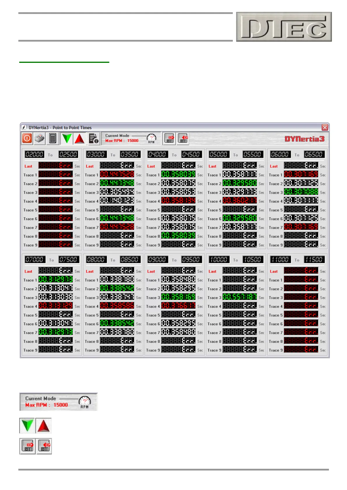
Point to Point Times
Opens a Window that compares multiple Runs and highlights which performed best (or worst) between any RPM or
speed points that you choose. The chosen traces are those selected in the GRAPH Screen. Manually enter any RPM or
speed points that you wish to analyse between.
Green highlights the trace that had the shortest acceleration time between your chosen points.
Red highlights the trace that had the longest acceleration time between your chosen points.
Tip- “Err” displays when there is no selected trace to display i.e. above trace 5,8,9 and last run were not loaded on the
main GRAPH Window so the data is missing!
The RPM or speed mode is automatically selected depending on what mode you are
currently running the dyno in (selected on the main screens with the ‘dial’ icon)
The minimum and maximum coloured selections can be turned on or off to help visibility. When both are
off the trace data is all white and not coloured.
Your range settings can be saved or loaded for future reference.