300
Tools
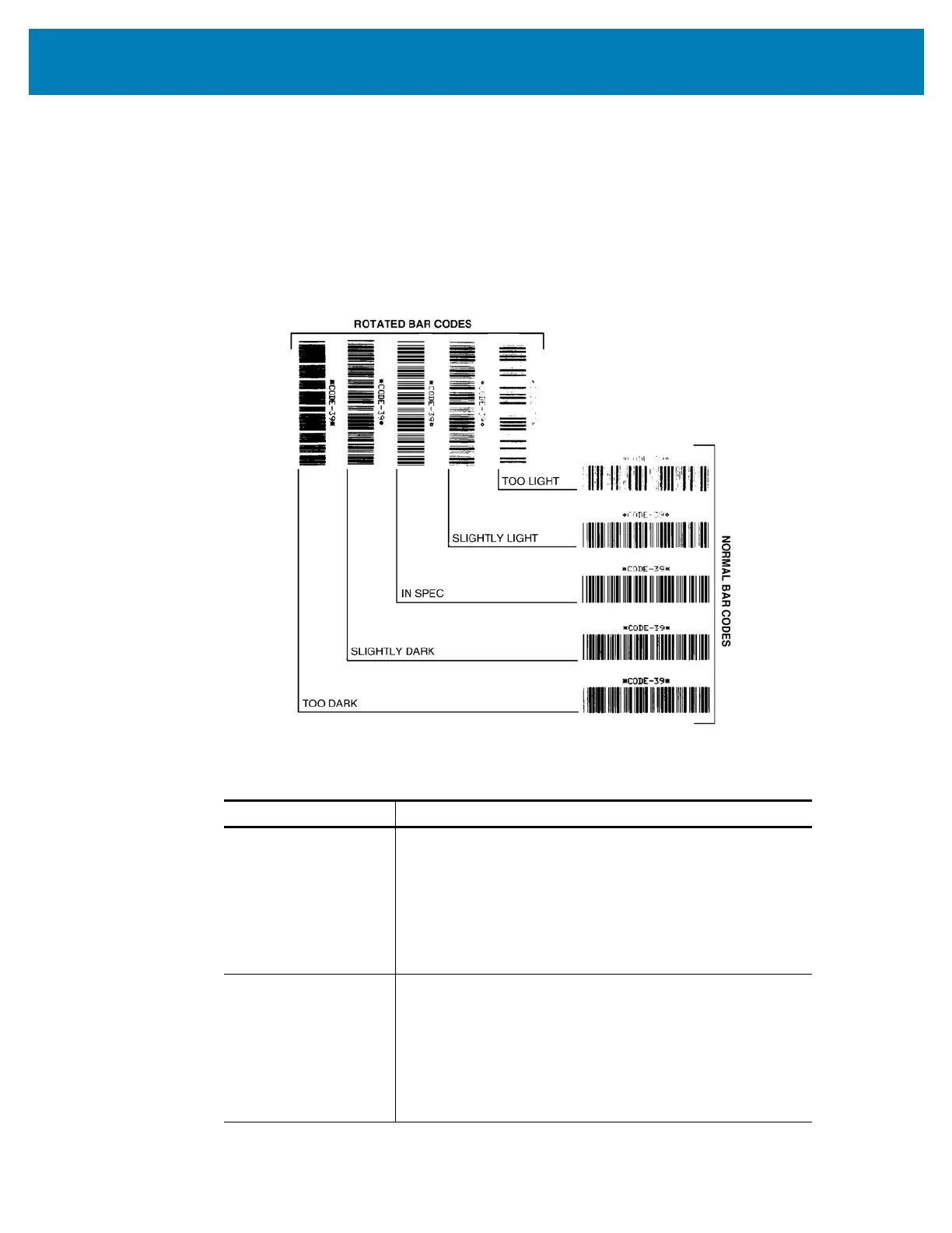
7. See Figure 2 and Table 1. Inspect the test labels and determine which one has the
best print quality for your application. If you have a barcode verifier, use it to measure
bars/spaces and calculate the print contrast. If you do not have a barcode verifier, use
your eyes or the system scanner to choose the optimal darkness setting based on the
labels printed in this self test.
Figure 2 • Barcode Darkness Comparison
Table 1 • Visual Darkness Descriptions
Print Quality Description
Too dark
Labels that are too dark are fairly obvious. They may be
readable but not “in-spec.”
• The normal barcode bars increase in size.
• The openings in small alphanumeric characters may
appear filled in.
• Rotated barcode have bars and spaces run
together.
Slightly dark
Slightly dark labels are not as obvious.
• The normal barcode will be “in-spec.”
• Small character alpha numerics will be bold and
could be slightly filled in.
• The rotated barcode spaces are small when
compared to the “in-spec” code, possibly making the
code unreadable.