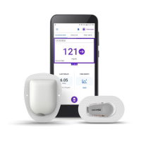
127
Browsing Your History and Records 1111 Browsing Your History and Records
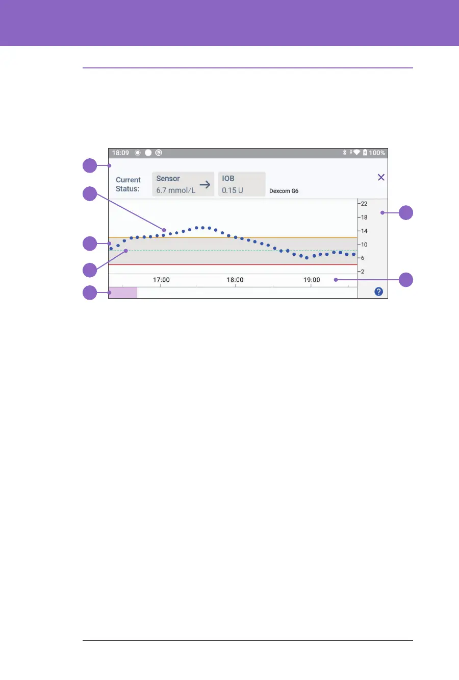
11.3. Sensor Graph States
e top section of the Sensor Graph changes colour based on your current system
mode.
When the Omnipod 5 System is in Manual Mode, the graph heading is light grey.
e graph shows your most recent sensor glucose values over the last 3 hours.
Note: You can tap the ? symbol in the lower right hand corner to see a Legend of
symbols used in the Sensor graph.
Tip: Use your Dexcom G6 app to view sensor glucose values that are more than
3 hours old.
1. Current Status: Your current sensor glucose value and trend arrow display,
along with the current IOB.
2. Sensor glucose trend line: Each dot on the graph represents a sensor glucose
value. Plotted values are from 2.2-22.2 mmol/L.
3. Glucose Goal Range: is shaded area shows your Glucose Goal Range. e
yellow line shows the Upper Limit, and the red line shows the Lower Limit
that you set in Settings.
4. Target Glucose: Dashed green line shows the Target Glucose that you set in
Settings. When the Activity feature is enabled, this value changes to
8.3 mmol/L.
5. Event area: e row below the graph shows:
• A purple background for periods of time that Omnipod 5 was in
Automated Mode
• A blank (white) background for the periods of time that Omnipod 5 was
in Manual Mode, when there was no active Pod, or when there was no
Pod communication
1
7
6
5
4
3
2