SCALANCE W User Interface
6.2 Main Window
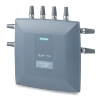
SCALANCE W1750D UI
64 Configuration Manual, 02/2018, C79000-G8976-C451-02
The
section lists the APs that exceed the utilization, noise, or error threshold.
It also shows the clients with low speed or signal strength in the network and the RF
information for the AP to which the client is connected.
The AP names are displayed as links. When an AP is clicked, the AP configuration
information is displayed in the Info section and the RF Dashboard section is displayed on the
SCALANCE W main window.
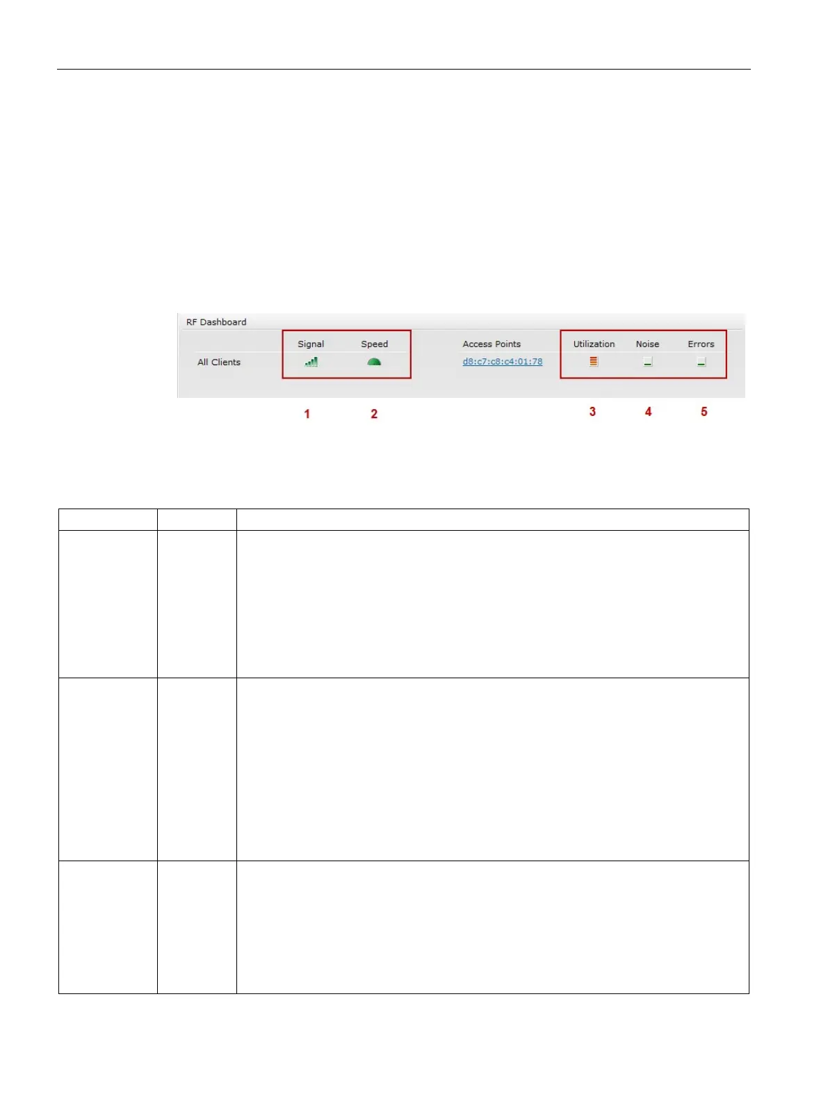
The following figure shows an example of the RF dashboard with Utilization, Band frames,
Noise Floor, and Errors details:
Figure 6-9
RF Dashboard in the Monitoring Pane
The following table describes the icons available on the RF Dashboard pane:
1 Signal Displays the signal strength of the client. Signal strength is measured in decibels. Depend-
ing on the signal strength of the client, the color of the lines on the Signal icon changes in
the following order:
• Green — Signal strength is more than 20 dB.
• Orange — Signal strength is between 15 dB and 20 dB.
• Red — Signal strength is less than 15 dB.
To view the signal graph for a client, click the signal icon next to the client in the Signal
2 Speed Displays the data transfer speed of the client. Depending on the data transfer speed of the
client, the color of the Speed icon changes in the following order:
• Green — Data transfer speed is more than 50% of the maximum speed supported by
the client.
• Orange — Data transfer speed is between 25% and 50% of the maximum speed sup-
ported by the client.
• Red — Data transfer speed is less than 25% of the maximum speed supported by the
client.
To view the data transfer speed graph of a client, click the speed icon corresponding to the
client name in the Speed column.
3 Utilization Displays the radio utilization rate of the APs. Depending on the percentage of utilization,
the color of the lines on the Utilization icon changes in the following order:
• Green — Utilization is less than 50%.
• Orange — Utilization is between 50% and 75%.
• Red — Utilization is more than 75%.
To view the utilization graph of an AP, click the Utilization icon next to the AP in the Utiliza-
 Loading...