23 Trends
314
To view the Vital Signs trend with one column for each NBP measurement (see “Defining the Column
Interval Using the NBP Measurement” on page 317):
1 With the Vital Signs trend open, select Interval.
2 Select NBP from the pop-up list.
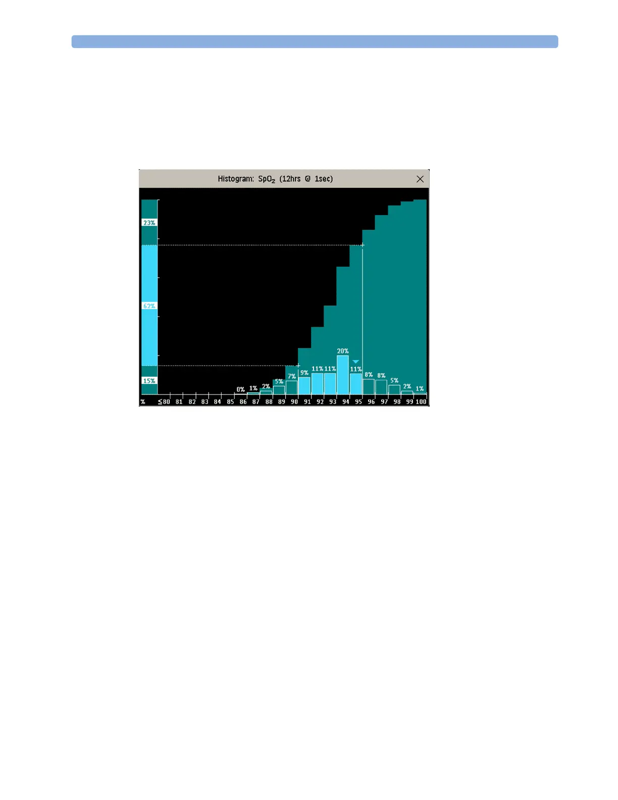
Viewing Histogram Trends
The title line of the window shows the label of the trended measurement and the resolution of the
data; in the SpO
2
histogram above, 1 second realtime samples.
The horizontal axis shows the range and unit of the displayed measurement. The vertical axis shows
the percentage of time.
The columns in the foreground show how much of the time the measured values fell into this range on
the scale. For example, in the histogram above, the SpO
2
value was between 93 and 94% during 20%
of the last 12 hours. The display of the percentage value above each column, can be switched on or off
by selecting the histogram. The arrow mark over a column shows that the currently measured value is
also in this range. The columns are displayed in the same color as the measurement data.
The columns in the background show the cumulative percentage value: each of the foreground
columns is added to the sum of those columns to the left of it. The cumulative columns can be
switched off using the
Curve On/Off pop-up key.
A question mark is displayed if less than two-thirds of the data are valid samples.
The pop-up keys in the window can be used to change the measurement, the time period and the
range. You can also print out a histogram report.
The SpO
2
and System Pulse histograms can use trended data or realtime data with 1 second samples.
Using Cursors
You can set two cursors that span a "corridor", for example to divide a histogram into in-range and
out-of-range areas. Or you can set both cursors to the same value and use them as one cursor to divide
the histogram into an upper and a lower segment.