606 Using Data & Statistics
The box plot is redrawn as a standard box plot with extended
whiskers.
The standard box plot’s whiskers use the minimum and maximum
points in the variable and outliers are not identified. The whiskers on
the plot extend from the minimum data point in the set (x-min) to the
first quartile (Q1) and from the third quartile (Q3) to the maximum
point (x-max). The box is defined by Q1, Med (median), and Q3.
Note: You can select
Show Box Plot Outliers on the Plot Properties
menu to return to the modified box plot.
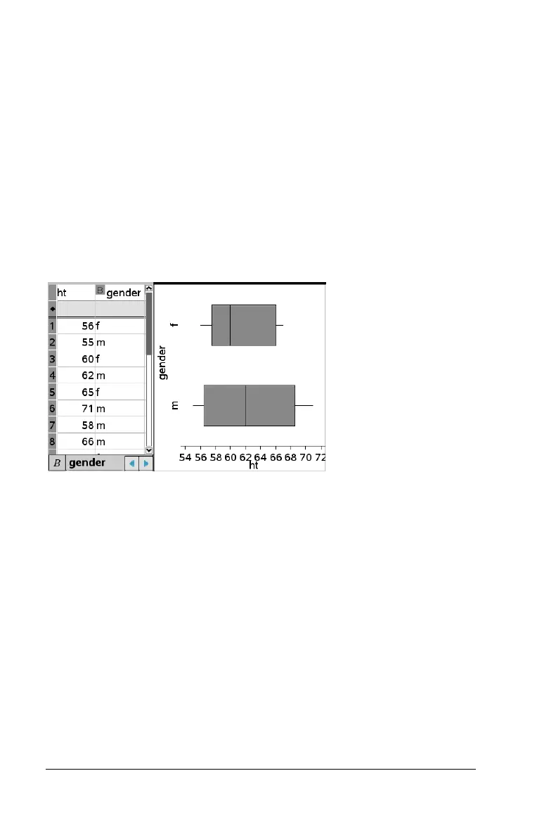
When you have a numeric list with a corresponding categorical list, you
can create a box plot split by category. Adding the categorical list splits
the box plot by category. A split box plot is useful for comparing the
spread of various populations.
Plotting histograms
A histogram plots one-variable data and depicts the distribution of data.
The number of bins displayed depends on the number of data points and
the distribution of these points. A value that occurs on the edge of a bin
is counted in the bin to the right.
Creating a histogram
1. Select the data that you want to plot as a histogram.
– For horizontal orientation, choose
Add X Variable.
– For vertical orientation, choose Add Y Variable.
2. From the Plot Types menu, select the Histogram tool.
In this example, the data from the box plot separates into points and
moves to form the bins of a histogram.
The histogram plots on the Data & Statistics work area.
 Loading...