Using Data & Statistics 611
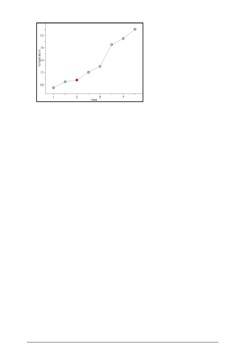
Note: The dots are connected in the order that they appear in the list
variable on the horizontal axis. To change the order, use the sort tool
in Lists & Spreadsheet.
3. Analyze and explore the data in the plot.
– Hover over a data point to view the summary data.
– Work with the data using the available tools on the Analyze
menu. For example, choose the Graph Trace tool and press the
arrow keys to move across the dots in the plot and view the
values.
Working with categorical plot types
You can sort and group data using the categorical plot types:
•Dot Chart
•Bar Chart
• Pie Chart
The categorical plot types can be used to compare the representations of
data across different plots. When the same variable (list) is used for a dot
chart and a bar chart or pie chart in a problem, selecting a data point or
segment in one of the plots selects the corresponding data point,
segment, or bar in all other plots that include the variable.
Creating a dot chart
The default plot type for categorical data is the dot chart.
When one variable is plotted, the value of each cell is represented as one
dot, and the dots are stacked at the point on the axis that corresponds to
the cell value.
1. In Lists & Spreadsheet, create a spreadsheet that includes at least one
column of string values that can be used as categories for data.