614 Using Data & Statistics
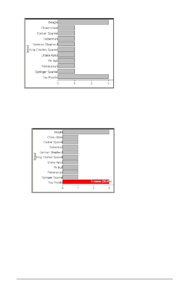
3. Explore the data in the plot.
– Hover over a bar to see a category summary (the number of cases
and percentage among all categories).
– Activate the Graph Trace tool and press 7 or 8 move across the
bars and view summary information.
Creating a bar chart from a frequency table or summary
data
1. On a new Data & Statistics page, create a bar chart with frequency or
summary data by choosing Add X Variable on the Plot Properties
menu.
Note: You can also create a bar chart with frequency by choosing
Add Variable with Summary List from the context menu of the Add
Variable region of an axis.
2. Select the desired variable from the pop-up.
3. Set the height of the bars with the summary variable by selecting
Add
Summary List
from the Plot Properties menu.

 Loading...