Using Data & Statistics 615
4. Select the summary list from the pop-up.
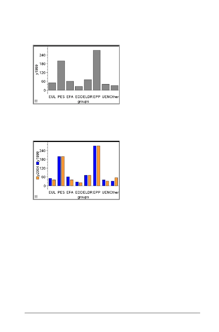
The bar chart plots on the work area. The icon in the lower left corner
indicates that this plot was generated from summary data.
5. Hover over a bar to see a category summary, or use the Graph Trace
tool on the
Analyze menu to move across all of the bars displaying
the summaries.
6. (Optional) Add summary lists to create a comparative bar chart.
Creating a pie chart
A pie chart represents categorical data in a circular layout and uses an
appropriately proportioned segment for each category.
1. Create a dot chart on the work area.
2. On the Plot Types menu, select Pie Chart.
The dots move by category into the segments of the pie chart.

 Loading...