616 Using Data & Statistics
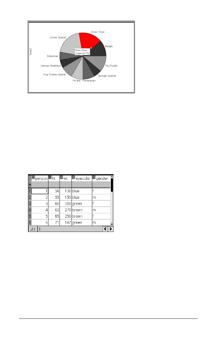
3. Hover over a segment to see the summary for the category, or use the
Graph Trace tool on the
Analyze menu to move across each segment
displaying all of the summaries. The summary shows the number of
cases for the category and the percentage among all cases.
Note: You can switch to a pie chart from a bar chart generated from
summary data.
Creating a comparative bar chart
This might be used to explore data in a 2-way table.
1. Enter the raw data on a Lists & Spreadsheet page.
2. From the Insert menu in the toolbar, select Data & Statistics.

 Loading...