Using Data & Statistics 617
Note: Your screen may differ, depending on the data you entered.
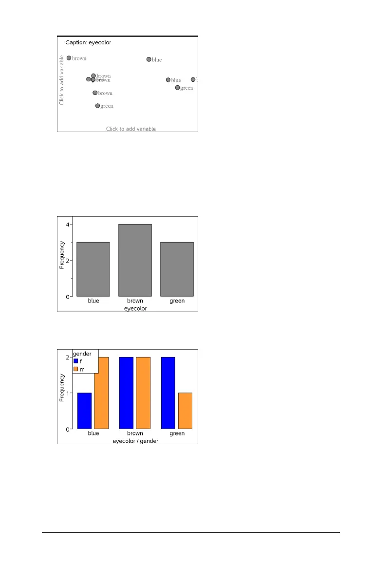
3. Click the Click to add variable field, and select eyecolor as the
variable for the x axis.
4. On the Plot Type menu, select Bar Chart.
The frequency of the eyecolor data is plotted.
5. To split the eyecolor data by gender, select the
Plot Properties menu,
select
Split Categories by Variable, and then select gender.
Splitting a numeric plot by categories
You can use a categorical split to sort the values plotted on an axis.
1. Open a problem that includes a Lists & Spreadsheet page, or create
data to be plotted in the Lists & Spreadsheet application.
In this example, lists contain dog breed and weight information.

 Loading...