CAPINTEC, INC. CAPTUS
®
4000e
3-6 GENERAL OPERATING INSTRUCTIONS August 15
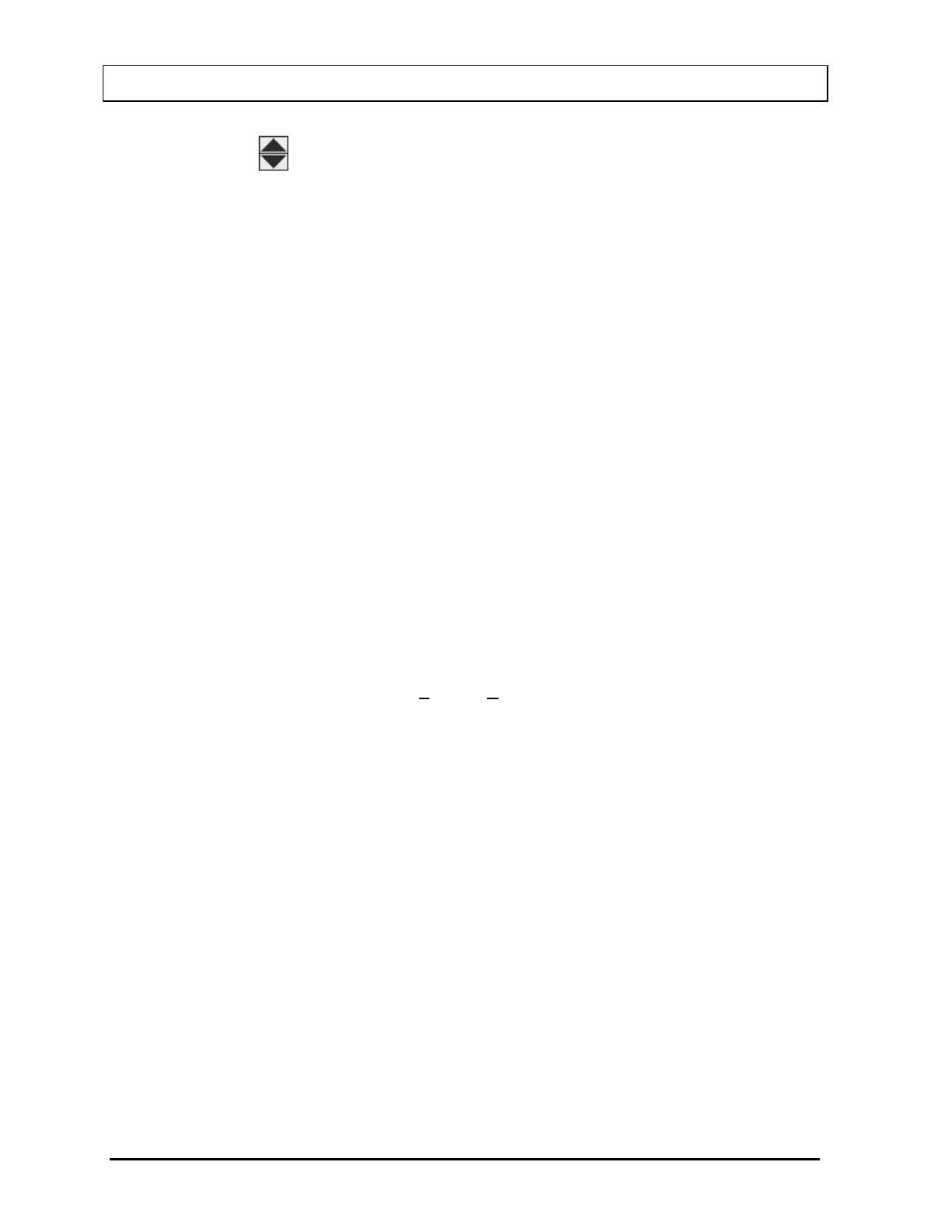
Spin Control
The spin control is also used to adjust values. The control consists of two back to
back arrows. Clicking an arrow with the pointing device causes the value under
control to change in the specified direction. The spin button can only be controlled
with the pointing device, your finger or stylus.
List Controls
There are two types of “list” controls used in the CAPTUS
®
4000e. Both appear quite
similar on the screen (refer to bottom of Figure 3-1). The only difference in
appearance is that on the Drop-Down Combo control, the arrow is not attached to text
box portion, while on the Drop-Down List control the arrow is attached. In function
both controls are similar except for one item. On the Drop-Down Combo control the
user can either enter new data directly into the text box or select from the list. In the
Drop-Down List control the user can only select from the list.
To select an entry from the list, use the pointing device left button to click the down
arrow or tap the down arrow with your finger or stylus. The list will appear. If there are
more items on the list than can be shown, vertical scroll bars will appear on the right
edge of the list. Place the pointer over the desired entry and double-click the left
pointing device button or tap the desired entry with your finger or stylus. The box will
retract and only the selected item will be displayed.
Menu Bars
Across the top of many forms you will find a menu bar. In the example, the menu bar
in Figure 3-1
contains two items: File and Setup. These are referred to as the top-
level menu items. A menu item can be selected either with the pointing device or by
typing Alt+K where K is the letter underlined in the name of the menu item. In some
cases, the top-level menu item causes action to be taken immediately. In other cases,
selecting it will cause another dialog box or menu to appear.
Buttons
Buttons are graphic symbols located on the user module test screens (refer to Figure
3-4 and Figure 3-6). The buttons that are in color are active or enabled and therefore
are selectable. The buttons that are grayed are inactive or disabled and therefore not
selectable.
 To Next Page