• X Scale: the X Axis can have its minimum and maximum manually specified, or set to Auto to show the
full domain of data. The X Axis can use a logarithmic scale, which can be useful for certain types of
data.
• Y Scale: the Y Axis for each pane can have its minimum and maximum manually specified, or set to
Auto to show the full range of data. The Y Axis can use a logarithmic scale, which can be useful for
certain types of data.
• Colors: the Grid, Axis, and Background can have their colors changed from the defaults.
• Zoom: these controls function the same as the other Zoom controls on the XY Graph Window.
Figure K.28. XY Graph Layout Settings
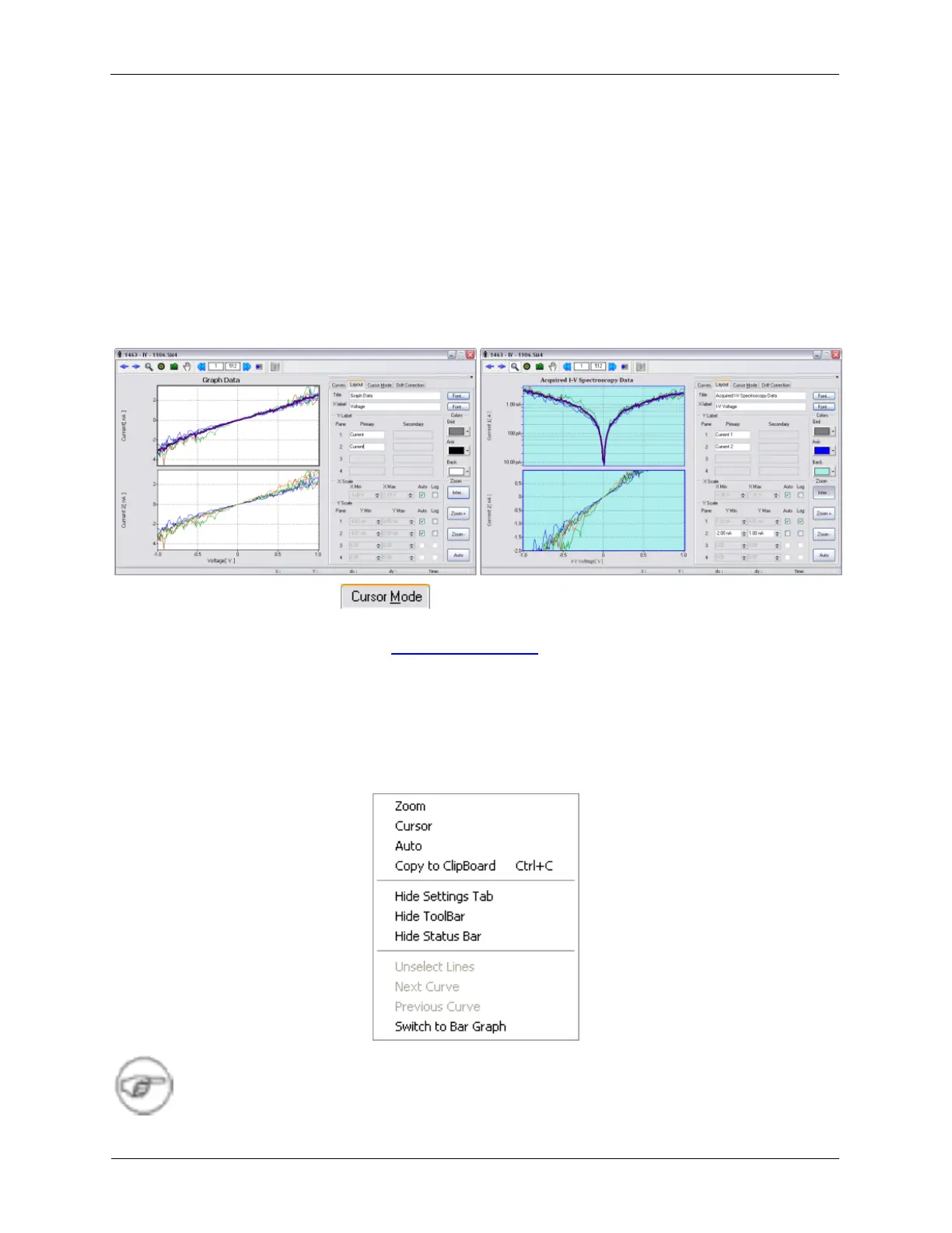
K.2.2.3. Cursor Mode Tab
Please refer to the above section on the Cursor Mode Toolbar.
K.2.3. Context Menu
The Context Menu can be accessed by right-clicking the XY Graph display. Some of the controls have the
same function as controls with the same name on other parts of the XY Graph Window.
Figure K.29. XY Graph Context Menu
Note
We have changed the default color of the secondary graph panes to red. This change was