Spectrum analysis
R&S
®
RTE
418User Manual 1326.1032.02 ─ 20
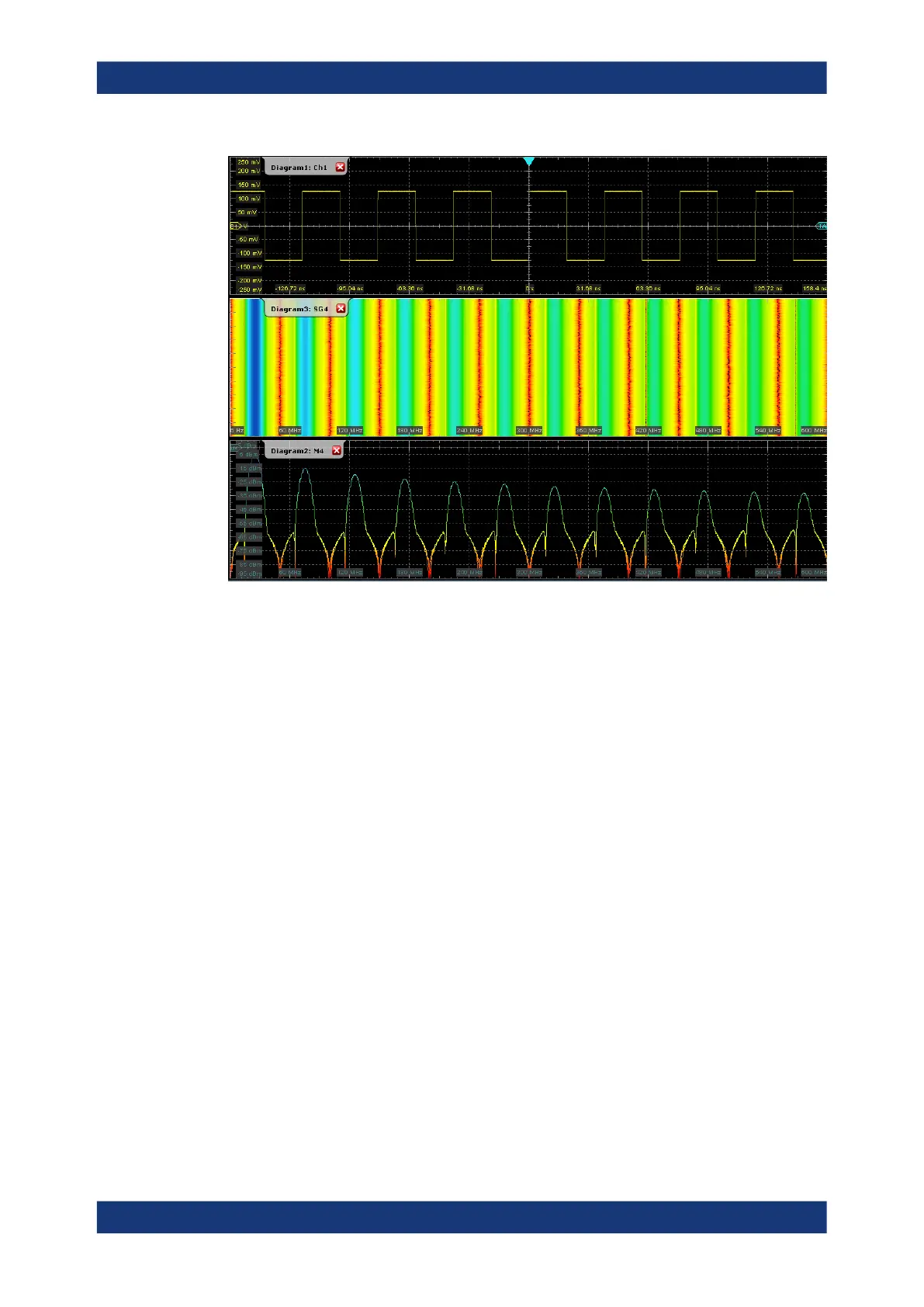
A spectrogram shows how the spectral density of a signal varies over time. The x-axis
shows the frequency, the y-axis shows the time. A third dimension, the power level, is
indicated by different colors. Thus you can see how the strength of the signal varies
over time for different frequencies.
The spectrogram is updated with each data acquisition, from top to bottom, so that the
most recent trace is at the bottom. Up to two time lines can be shown at a specified
position so that you can analyze the spectrum at a specific point in time.
The spectrum diagram indicates the power vs. frequency values for a single data
acquisition. If a time line is enabled, the spectrum shows the results at the selected
time. Otherwise, the spectrum shows the results of the most recent data acquisition.
9.2.2 Spectrum Analysis functions
In addition to spectrograms, the Spectrum Analysis option also provides some new
automatic measurements based on spectrum waveforms.
●
A peak list measurement detects all peaks above a user-definable threshold and
optionally indicates the peaks in the spectrum diagram.
Spectrum Analysis (option R&S
RTE-K18)
 Loading...